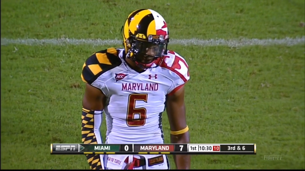
Get your sunglasses ready folks, because the images in this post might burn your retinas. Thanks to the University of Maryland’s football team, there is a new entrant into the “Worst Uniform Ever” contest, a title that MLB had an ironclad hold on. That was until the Terps came out and played in these monstrosities:

AHHHHHHHHHHHH! My eyes!!!!!!! Apparently those are supposed to represent the Maryland state flag and not what would happen if the villain Two-Face from the Batman comics were allowed to design sports uniforms, which is what I orginally thought. For the record, my explanation would’ve been way cooler.
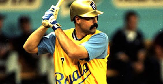
As astoundingly hideous as those uniforms might be, they might not be the worst ever. I mean, maybe if they just picked one pattern and applied it to both sides of the body, it might kind of work… maybe. What definitely doesn’t work is the current titleholder of the worst uniforms ever, which, of course, still belongs to the ill-fated “Throwforward” uniforms MLB foisted upon the masses. Surely, you must remember this abomination?

This has the same color scheme, but it has the added bonus of a sneering yet completely unintimidating giant pirate face. Or how about this one?

Really? Gold helmets and a yellow tarp of a jersey? Not even that awesome ‘stache can save this one from the annals of awful uniforms.
But those two are just the runners-up to this:

While it may lack a garish color scheme, it does have the bizarre Artist Formerly Known as Prince-esque symbol. But the reason it has the symbol is because this “throwforward” uni throws so far forward that the Mets are actually from MERCURY. As in the planet. That makes it not only ugly as sin but twice as stupid.
I think baseball still holds the title, but this bout might have to go to the judges’ scores. What say you, loyal readers? Who wore it worse, the Terps or the uniforms of the horrible and ugly MLB future?
