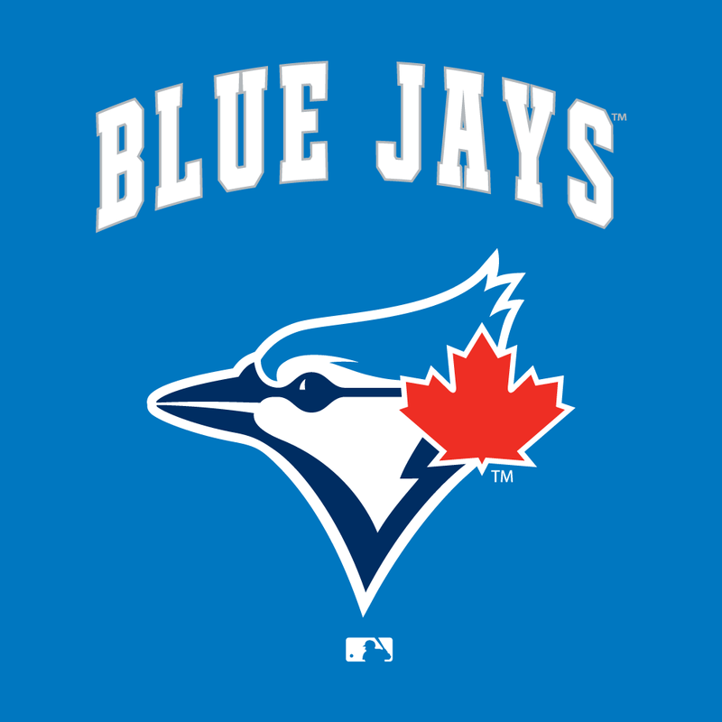
Pay attention, Florida/Miami Marlins, you are about to get schooled on what a new logo should look like. Behold the new logo for the Toronto Blue Jays:

Notice the lack of what appears to be rainbow vomit all over the place. Already this logo is one hundred times better than the monstrosity the Marlins unveiled earlier this week.
Granted, it isn’t exactly new for the Jays since it is really nothing more than an updated version of the Blue Jays’ original logo.

The differences are slight, but this newish logo is an upgrade its predecessor. The bird is a touch more intricate and the red maple leaf is a bit more prominent, which is worth noting since the Jays have been rumored to have real interest in re-branding themselves as “Canada’s team,” so the leaf and the color red could play into the actual new uniforms more. I only hope that the script font in the new logo is just a placeholder because I have a certain nostalgia for the old school white inline font. I mean, if they are going to revert to the old logo, they might as well go to the old iconic font as well.
While the new and original logo vary by a small degree, this is a MASSIVE improvement over the current Toronto uniforms. Not only is the angry-looking, cartoonish Blue Jay gone (which is kind of a shame, in a certain respect, because it seemed like an Angry Birds corporate sponsorship waiting to happen), but so is the color black that took over the uniform. Call me crazy, but I always thought that the Blue Jays should have, you know, blue uniforms.
Kudos to you, Toronto Blue Jays. Way to not “pull a Marlins.”
