What do you do when you have one of the most popular and beloved brand names in all of minor league baseball, as the Quad Cities River Bandits did from 1992-2003?
You immediately jettison it and replace it for something that became almost universally reviled from the get-go, right?
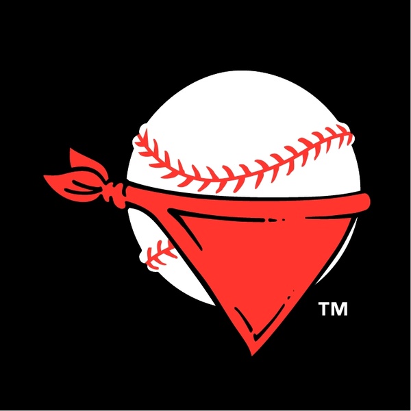
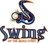
That’s what River Bandits ownership did after the 2003 season, getting rid of the logo you see on the left in favor of a rebranding on the right that would be mocked throughout the Quad Cities community throughout much of its existence.
The Swing of the Quad Cities was supposed to be a nod to the area’s rich jazz heritage. The Quad Cities after all had produced the legendary Bix Beiderbecke and the region is well known for its annual jazz festivals. Associating the local nine with that heritage seemed to make sense.
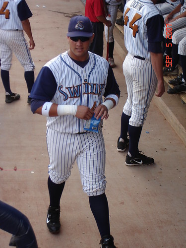
There were several problems with this though. The name itself never caught on locally, with many thinking it was just strange to have the team name in front of the location. The color scheme — light blue and burnt orange — looked strange on the field and in promotional materials. The primary logo, a baseball shooting out of a saxophone, didn’t have the same cool cache that the River Bandits’ baseball with a bandanna around it did.
And the uniforms…well those were another story in and of themselves.
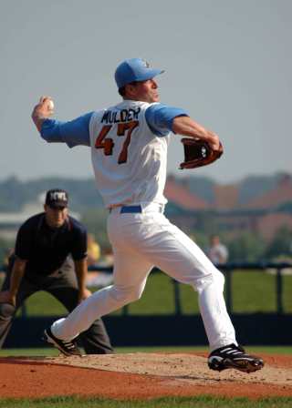
Throughout the brand’s brief history, the uniforms looked just plain busy. As you can see more prominently on Mark Mulder’s jersey, the numbers came in two different sizes, with the one on the left being smaller than the one on the right, creating an unusual and unpleasant aesthetic that only served to further alienate fans.
After years of declining interest, the team was sold and decided to go back to being the Quad Cities River Bandits prior to the 2008 season. The end result is this beauty of a logo that has consistently been one of the best selling in all of minor league baseball.

That is what a minor league baseball logo should look like. It’s crisp, it’s clean, it incorporates part of the team’s location (the iconic Centennial Bridge that links Davenport, IA to Rock Island, IL), and it’s just plain cool. It’s a branding re-do that proved to be lucrative financially and in terms of rebuilding fan interest within the community.
The new River Bandits logo combined with new ownership and front office have helped spearhead the team to record success off the field. Attendance and apparel sales are up, and the Cardinals Class-A affiliate has gone from being just another minor league baseball team to being a model for how franchises should be run both on and off the field.
Since then, the team has done everything they possibly can to make fans forget about the Swing of the Quad Cities era. The team has held numerous promotions encouraging fans to trade in their Swing merchandise for a River Bandits shirt while holding on-field promotions involving fans throwing Swing merchandise into the trash. The current front office has made it clear that that era is one they want no part of and they’ve been extremely successful in their efforts.
But for as much as the team is trying to get fans to forget that the Swing of the Quad Cities ever existed in the first place, the reviled old logo will always have a rather unique place in Quad Cities baseball history.

The movie Sugar was filmed at Davenport’s Modern Woodmen Park back in 2007, when the team was still known as the Swing. Filmmakers decided to use the team’s actual uniforms in the movie, which is about a Dominican player named Miguel “Sugar” Santos who comes to America to play for the fictional Class-A Bridgetown Swing in Iowa and pursue his dreams of playing in the Major Leagues. The movie itself is quite good regardless of whether or not you’re a baseball fan even if the uniform worn by the main character hurts your eyes to look at.